Monday, September 30, 2013

Elements of Art and Principles of Design

Line- are marks made by a pointed tool: brush, pencil, pen, etc. Lines can vary in width, direction, curvature, length, or color.
I chose this painting because of the lines creating the wood. The faces on the wood bring this painting to life.
I chose this picture because the green stuff go straight up in lines. This looks sharp.

Shape- are formed wherever the ends of a continuous line meet. Geometric shapes such as circles, triangles or squares have perfect, uniform measurements and don't often appear in nature. Organic shapes are associated with things from the natural world, like plants and animals.
This painting has different type of shapes. It has a lot of squares and cylinders.
I chose this picture because of the mesmerizing circles. They all connect in a pattern.

Color- wheels show the primary colors, secondary colors, and the tertiary (intermediate) colors. They also show the relationships between complementary colors across from each other, such as blue and orange; and analogous (similar or related) colors next to each other such as yellow, green, and blue. Black and white may be thought of as colors but, in fact, they are not. White light is the presence of all color; black is the absence of reflected light and therefore the absence of color.
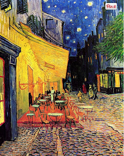
This painting has wonderful colors. The night sky looks beautiful and the color of the floor gives the stone light from the things around it. 
I chose this picture because of the colorful lights lighting the parkway. It almost looks like a rainbow.

Value (Tone)- refers to dark and light; the value scale refers to black and white with all gradations of gray in between.  Value contrasts help us to see and understand a two-dimensional work of art.
I wonder why the painter put flowers in his hand. This painting shows the two-dimension of the person about to throw the flowers.
I chose this picture because it shows the gray bringing thing picture to life.

Form- describes objects that are three-dimensional, having length, width, and height.
I chose this picture because of the 3-D is shows of the man holding the shine ball.
I chose this picture because it shows the dimension of the building from the bottom.


Texture- can be rough, bumpy, slick, scratchy, smooth, silky, soft, prickly--the list is endless.  Texture refers to the surface quality, both simulated and actual, of artwork.
I chose this painting because i like how smooth the flower looks.
I chose this picture because how the fruit looks. I just can't tell if its soft or pointy.

Space-refers to distances or areas around, between, or within components of a piece. Space can be positive (white or light) or  negative (black or dark), open or closed,shallow or deep, and two-dimensional or three-dimensional. 
I chose this painting  because of the way the thing seems to go far back.
I like the way this picture makes it look like the railways go to far off in the distance.

Balance-  is the comfortable or pleasing arrangement of things in art.  There are three different types of balance: symmetrical, asymmetrical, and radial. The human figure is symmetrically balanced; the same on the left and right side. The tree is asymmetrically balanced; its branches are not distributed equally on each side, but their total weight is balanced left and right. The sun is an example of radial balance; all its rays are equal in length from the center.
I chose this painting because on the symmetricalness of the soup cans. I really looks the same on both sides.
I chose this picture because of the color. It looks like the yellow thing is going to suck up the green liquid.

Contrast- is created by using elements that conflict with one another. Often, contrast is created using complementary colors or extremely light and dark values. Contrast creates interest in a piece and often draws the eye to certain areas. It is used to make a painting look interesting.
I chose this picture because painting because how the shading make the painting look real.
This picture has dark and light colors but it doesn't look as great as the painting, it looks more plan.

Emphasis- in the focal area of an artwork gives it importance.  An artist may stress some elements of the design over others. The eye of the viewer will focus on the area of emphasis or center of interest first, then take in the rest of the composition. 
I chose this painting because the painting focuses on the villagers. They are the main focus of this painting.
I chose this picture because the was the clown fish pops out the most from its bright colors.

Movement- in an artwork means the artist is taking viewers on a trip through the work by means of lines, edges, shapes, and colors often leading to the focal area.  Movement is a visual flow through the composition. It can be the suggestion of motion in a design as you move from object to object by way of placement and position.  Directional movement can be created with a value pattern. It is with the placement of dark and light areas that you can move your attention through the format.
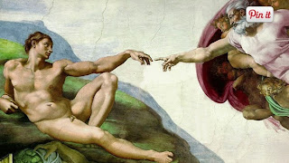
This painting is quite awkward but it shows the old man and reaching out fort the younger man.
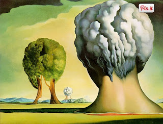
I chose this picture because the smoke looks like it is flowing down the path.

Pattern- are made in art when the same shapes or elements are repeated again and again.  Pattern uses the elements of art in planned or random repetitions to enhance surfaces of paintings or sculptures.
I chose this picture because it repeats the soup can over and over and over again.
I chose this picture because it also repeats its shape of the triangles.

Rhythm- is the repetition of shapes, lines, and forms.  Rhythm is a movement in which some elements recurs regularly.  Like a dance, it will have a flow of objects that will seem to be like the beat of music.
I chose this painting because is uses the same lines and forms to create the building.
I chose this picture because of the repetition of the burgers. 


Unity-means that all elements in an artwork are in harmony.  Unity brings together a composition with similar units.  For example, if your composition was using wavy lines and organic shapes you would stay with those types of lines and not put in even one geometric shape.
This painting has similar shapes all around it. It also uses more than just the same shape. 
I chose this picture because zebras are wonderful creatures. These zebras look a similar to each other just the a different position.


Friday, September 20, 2013

Black and white part 2


Garry Winggrand was born January 14, 1928 in New York City. He died in March 19, 1984 in Tijuana, Mexico. Winggrand Studied at the City College of New York. He was one of the greatest documentary photographers of his era. Winogrand was Known for his portrayal of American life in the early 1960s. These are more of his pictures.


40 Greatest pictures


I like how the picture was captured from space. I picked this picture because it shows or Earth and w don't get many chances to see the Earth so small.
                                          William Anders

I like the theme this picture sets of the soldiers. I picked this picture because i enjoy watching soldiers go off to war. This picture looks great in black and white.                       
                                                        Robert F. Sargent

 I like the way the picture just focused on his face. I picked this picture because the emotions on his face tell it all. This man just wants to go home to his family.
                                                       Goran Tomasevic

Wednesday, September 18, 2013

Post Shoot Reflection

http://alejandrosphotoblog.blogspot.com/

Negative

I don't like how the pictures look simple. He could have used different angels and lighting to give the picture some emption.

The picture of red wasn't much red, more like yellow. He should have zoomed in closer to the letter in red.

Positive

I like the Picture of the flag. The light from the sun gives the flags a shine. The wind seems to be blowing because he captured the flags moving.

Personally seeing a go-cart and being able to to ride in it makes me happy. The picture of the go-cart was good, i can see all of it. I just hint it should have been in a better angle.

National Geographic


This is my favorite picture out of the other 44. I think its awesome how the bubbles are frozen under the water. I've never seen this before. The cold is my favorite type of temperature. The mountains in the background are amazing and look so small. The sky also matches the color of the nature giving it the perfect lighting. I can also see the water crack in some parts.

Red,Metal,and Happy

Red

                                                                              Metal

Happy


Thursday, September 12, 2013

Camera Parts


Aperture- A opening through which light travels coupling between lens.

Shutter- A device on the camera that allows light on to the film or the digital camera picture.

Exposure- allowing the image capture device to be exposed to the image of the scene.

Depth of field- A characteristic of a camera that can be used to enhance the image composition of the photo.

F-stop- The setting of adjustable lens aperture, as indicated by an f number.

Focal length- The distance between the imaging surface plane and a point where all light rays intersect inside the lens.


Front buttons 

Shutter button- It opens to capture a picture and then it closes
Flash button- The light that brightens the picture.
Power switch- Turns on the camera.
Lens release button- Is responsible for releasing the lens from the body to facilitate removal.
Mode dial- A dial used on digital cameras to change the camera's mode.

Tuesday, September 10, 2013

Camera History


1. Explain the “camera obscura” effect. How is it achieved?
The hole acted like a lens, focusing and projecting light onto the wall of the dark chamber.
2. What invention during the 17th Century helped man get a step closer to creating the modern camera?
Isaac Newton and Christian Huygens perfected the understanding of optics and the process of making high quality glass lenses.
3. What were the parts of the first modern camera invented by Niepce?
Joseph Nicéphore Niépce added film to create the first successful photograph.
4.What do modern digital cameras have in common with Niepce’s camera?
Light passes through the lens, into the camera, and exposes the film.
5. What do digital cameras use to capture an image?
Digital cameras capture the images with an electronic sensor called a CCD.
6. What is the difference between the Auto Mode and the Program mode?
In Auto mode the camera will completely control flash and exposure. Program mode won't 
7. What is the Portrait mode used for? How does it work?
Attempts to blur out the background, the camera will try to use the fastest available lens setting.
8. What is the Sports mode used for? (not just sports) How does it work?
It freezes motion, camera will use the highest shutter speed possible.
9. Why should you do a half press on the trigger button?
A half-press will tell the camera that you're almost ready to take a shot and to be prepared.
10. What does this symbol mean?
Disabled flash.


 When would you use this?
When using natural light to set a different mood.
11.What does this symbol mean?
Auto-flash is enabled by default and will automatically fire if the camera thinks it needs light.
                                  
                                     When would you use this?
When you need more light for the picture.
12. What happens to your photo if there is too much light?
The picture will be washed out.
13. What happens to your photo if there is not enough light?
The picture will be too dark.
14. What is a “stop.”
A change in brightness of the light.
15. How many stops brighter is the new planet if there are two sons instead of one?
It would be the same.
16. How many stops brighter is the new planet if there are four sons instead of two?
It would be brighter.
17. What affect does a longer shutter speed of have?
More light.
18. What affect does a shorter shutter speed have?
Less light.
19. What does the aperture control?
Opening where the light goes through.
20. When adjusting the aperture, how can you increase the amount of light?
When you increase the opening.


Master of Black and White Photography

Adam Storm
                                                                     
                                                                   Garry Winogrand
                                                                       
                                                               Jacques-Henri Lartigue

Wednesday, September 4, 2013

First Photos Best and Worst

I took pictures of my fellow classmate. My worst photo is the one that looks like i got him off guard. The best one i picked it because i captured his full expression of his face.
Worst
                                                                               Best