Monday, October 21, 2013

Mural

1. What theme could you use here at school to make your own mural that tells a unique Akins story? Be specific. Explain what subjects you will include in your mural.
We can use our different academy options for the students and display all the hard work we put in.
2. Why is this theme worth devoting time time and effort to capture? Why would other students care about this theme?
It shows the relationship you have to your school and how much you are for your education.
3. What are the advantages and disadvantages to using a phone camera to do this project?
Phone cameras are easy to use but most phones don't have lots go mega pixels.
4. What are the advantages and disadvantages to using an SLR camera to do this project?
A SLR camera has many options and is dedicated on capturing the best picture.
5. Should we use phones or SLR cameras for this project? Why?
I think we should use SLR cameras because the was they take pictures is way better than a phone. The SLR camera gives more options on how the picture will come out.

Africa Project preview

This Africa powerpoint was amazing all the picture on in look so stunning. All the animals captured in the pictures were all well took. The poses of the animals were outstanding. Black and white gave the pictures or effect to the background.  
This picture is my favorite out of the rest. I like the way the elephant is posed. This dust ball looks like it hit the elephant straight in the face but the animal doesn't seem to care and just walking along. It looks so clear the way the dust goes across the elephant.

a. What kind of camera did he use?
Pintex 67ll only two fixed lens
b. What is his reason for taking the photos?
Show that the animals have reason and are wonderful creatures.
c. What is his hope by taking these types of photos?
Wanted to show that all living creatures are beautiful.
d. Find something he has to say about Africa and post the quote on your blog
I'm not interested in creating work that is simply documentary or filled with action and drama, which has been the norm in the photography of animals in the wild. What I am interested in is showing the animals simply in the state of Being. In the state of Being before they are no longer are. Before, in the wild at least, they cease to exist. This world is under terrible threat, all of it caused by us. To me, every creature, human or nonhuman, has an equal right to live, and this feeling, this belief that every animal and I are equal, affects me every time I frame an animal in my camera. The photos are my elegy to these beautiful creatures, to this wrenchingly beautiful world that is steadily, tragically vanishing before our eyes.

Thursday, October 17, 2013

Academics Shoot


Line
1. How well did you follow the rule?
This picture very well follow the rule. There lines all over the walls behind Julio which is in journalism.
2. What is the subject (be very very specific)?

3. Is it clear to people looking at your photos what the subject is?

4. If you didn't follow the rule well, what could you have done differently?


Mergers
Balance
Rule of Thirds
Frame
Simplicity 

Friday, October 4, 2013

Academics Shoot Review

The Story
I think this one tells the best story. This tells me a day in science class not just a normal day but a day everyone is excited for. Everyone likes doing labs in class they are the most fun. It seems that foam has shot in to the air from a reaction that has happen. These girls are very happy.

Action and Emotion
This picture shows a teacher holding another older teacher as a hostage.The old man does not seem scared, they seem to be playing around because of the smiles on there faces. 

Academics and Community Service


I chose this picture because i found it interesting. This reminds me when me and my friend use to go into the woods and pretend we were navy seal. They look like they are ready to leave from a mission they have done. This picture shows the rule of thirds.

Filling the Frame
This frame is filled with many people. All the people are around one desk and are feeling on the smoke that is being created in the middle. This picture if full of things.


1. Where do you think you could take photos like the ones you look at today?
I think we can take some like this in the library or in the fine arts building.
2. Whose classroom would you like to visit and take photos in?
I would like to go in the art room and gym and library.
3. What will you do, as the photographer, to get amazing photos like you look at today?
I will try to get the best lighting and angle. I will also try to position the object in a great place.

Wednesday, October 2, 2013

9/11 reflection

 This picture shows merging. All the lights are so bright t seems to light up the whole block. Most the light shines on each other on most building are hard to see.
 This picture shows simplicity. There was another picture of the flag from a far distance. i picked the closer one because it shoes only the flag brining it out.
 This picture shows discussion. The picture just shows one thing with the some back ground. It is zoomed in to the WTC which mean World Trade Center.
 This picture is framed. It show the two girls in the very front walking down the street. In the back it shoes all the cars parked and the no cars in the middle of the road.
 This picture shows balance. It shows the building that is destroyed in the accident. This building look the same on both sides.
 This picture shows the rule of third. It picture is about the road being all dirty. The bull dossier in the other hand is so big you have nothing to do but to look at it. This is the main attraction on the right side.
This picture shows lines, lots of them. The top part is where the fire is going on and most people didn't want to burn alive. Close to the bottom theres a man that has jumped off. This seems pretty sad that this had to happen.

Photo manipulation and ethic

The picture has three missiles launching in the sky in the desert range in Iran. There was suppose to be 4 but one failed to fire. Some one photoshopped the picture to make it seem like there is four. This was maybe to scare the United States and to show there that there entry is strong.

I like the way they changed this picture. The news paper in the left side seems to have changed her teeth to make them look better. This is a good thing to have edit her teeth. Many people would have made fun of the women with her nasty teeth.

Monday, September 30, 2013

Elements of Art and Principles of Design

Line- are marks made by a pointed tool: brush, pencil, pen, etc. Lines can vary in width, direction, curvature, length, or color.
I chose this painting because of the lines creating the wood. The faces on the wood bring this painting to life.
I chose this picture because the green stuff go straight up in lines. This looks sharp.

Shape- are formed wherever the ends of a continuous line meet. Geometric shapes such as circles, triangles or squares have perfect, uniform measurements and don't often appear in nature. Organic shapes are associated with things from the natural world, like plants and animals.
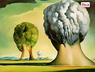
This painting has different type of shapes. It has a lot of squares and cylinders.
I chose this picture because of the mesmerizing circles. They all connect in a pattern.

Color- wheels show the primary colors, secondary colors, and the tertiary (intermediate) colors. They also show the relationships between complementary colors across from each other, such as blue and orange; and analogous (similar or related) colors next to each other such as yellow, green, and blue. Black and white may be thought of as colors but, in fact, they are not. White light is the presence of all color; black is the absence of reflected light and therefore the absence of color.
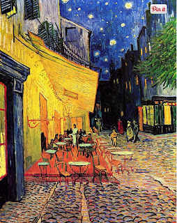
This painting has wonderful colors. The night sky looks beautiful and the color of the floor gives the stone light from the things around it. 
I chose this picture because of the colorful lights lighting the parkway. It almost looks like a rainbow.

Value (Tone)- refers to dark and light; the value scale refers to black and white with all gradations of gray in between.  Value contrasts help us to see and understand a two-dimensional work of art.
I wonder why the painter put flowers in his hand. This painting shows the two-dimension of the person about to throw the flowers.
I chose this picture because it shows the gray bringing thing picture to life.

Form- describes objects that are three-dimensional, having length, width, and height.
I chose this picture because of the 3-D is shows of the man holding the shine ball.
I chose this picture because it shows the dimension of the building from the bottom.


Texture- can be rough, bumpy, slick, scratchy, smooth, silky, soft, prickly--the list is endless.  Texture refers to the surface quality, both simulated and actual, of artwork.
I chose this painting because i like how smooth the flower looks.
I chose this picture because how the fruit looks. I just can't tell if its soft or pointy.

Space-refers to distances or areas around, between, or within components of a piece. Space can be positive (white or light) or  negative (black or dark), open or closed,shallow or deep, and two-dimensional or three-dimensional. 
I chose this painting  because of the way the thing seems to go far back.
I like the way this picture makes it look like the railways go to far off in the distance.

Balance-  is the comfortable or pleasing arrangement of things in art.  There are three different types of balance: symmetrical, asymmetrical, and radial. The human figure is symmetrically balanced; the same on the left and right side. The tree is asymmetrically balanced; its branches are not distributed equally on each side, but their total weight is balanced left and right. The sun is an example of radial balance; all its rays are equal in length from the center.
I chose this painting because on the symmetricalness of the soup cans. I really looks the same on both sides.
I chose this picture because of the color. It looks like the yellow thing is going to suck up the green liquid.

Contrast- is created by using elements that conflict with one another. Often, contrast is created using complementary colors or extremely light and dark values. Contrast creates interest in a piece and often draws the eye to certain areas. It is used to make a painting look interesting.
I chose this picture because painting because how the shading make the painting look real.
This picture has dark and light colors but it doesn't look as great as the painting, it looks more plan.

Emphasis- in the focal area of an artwork gives it importance.  An artist may stress some elements of the design over others. The eye of the viewer will focus on the area of emphasis or center of interest first, then take in the rest of the composition. 
I chose this painting because the painting focuses on the villagers. They are the main focus of this painting.
I chose this picture because the was the clown fish pops out the most from its bright colors.

Movement- in an artwork means the artist is taking viewers on a trip through the work by means of lines, edges, shapes, and colors often leading to the focal area.  Movement is a visual flow through the composition. It can be the suggestion of motion in a design as you move from object to object by way of placement and position.  Directional movement can be created with a value pattern. It is with the placement of dark and light areas that you can move your attention through the format.
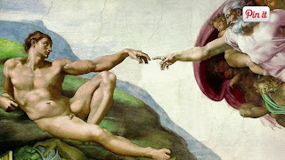
This painting is quite awkward but it shows the old man and reaching out fort the younger man.
I chose this picture because the smoke looks like it is flowing down the path.

Pattern- are made in art when the same shapes or elements are repeated again and again.  Pattern uses the elements of art in planned or random repetitions to enhance surfaces of paintings or sculptures.
I chose this picture because it repeats the soup can over and over and over again.
I chose this picture because it also repeats its shape of the triangles.

Rhythm- is the repetition of shapes, lines, and forms.  Rhythm is a movement in which some elements recurs regularly.  Like a dance, it will have a flow of objects that will seem to be like the beat of music.
I chose this painting because is uses the same lines and forms to create the building.
I chose this picture because of the repetition of the burgers. 


Unity-means that all elements in an artwork are in harmony.  Unity brings together a composition with similar units.  For example, if your composition was using wavy lines and organic shapes you would stay with those types of lines and not put in even one geometric shape.
This painting has similar shapes all around it. It also uses more than just the same shape. 
I chose this picture because zebras are wonderful creatures. These zebras look a similar to each other just the a different position.